ANATOMY OF THE PERFECT AD
mastering
display ads in consumer health
September 25, 2024

Introduction
Why am I considered an expert in online marketing? Beyond understanding the nuances of the market, setting up a robust marketing stack, crafting strategic content, enhancing digital presence, and building a loyal community, my real obsession lies in two key areas: banner ads and marketing funnels. In this post, we'll dive deep into the former, a topic I haven't explored since my days writing for the award-winning Wildfire Interactive blog. Those posts on optimizing Facebook ads no longer exist since the Google acquisition of Wildfire, but I'll never forget the numerous Fortune 500 clients who told me how they significantly improved the performance of their banners by using the tips and tricks I provided.
Why Focus on Banner Ads?
It's simple: a well-crafted banner ad can set your customer acquisition on autopilot. Imagine creating an ad that not only attracts clicks but maintains a high conversion rate once users land on your page. Such efficiency dramatically lowers your cost per acquisition (CPA), allowing you to scale spending while maintaining profitability. This is because an optimal CPA reflects a perfect balance between click-through rates (CTR) and conversion rates (CR)—a metric far more indicative of success than CTR alone. If your ad agency boasts about high CTRs without discussing CR or CPA, consider it a red flag.
So, how do we create banner ads that achieve high click-through rates and effective conversions on the website? The secret lies in mastering the art of ad crafting and embracing a culture of rapid testing and iteration. By adhering to key rules for designing high-performance banner ads and continuously refining our approach through targeted experiments, we ensure our ads not only attract attention but also drive meaningful engagement that converts. Let's delve into these critical areas:
Rules for Crafting High-Performance Banner Ads
Creating high-performance ads goes beyond mere visual appeal; it requires a strategic approach guided by proven principles. In highly competitive sectors like education and financial services, meticulously crafted banner ads are essential for standing out. Companies like QuinStreet set industry standards by using data-driven designs and precise audience segmentation, ensuring their ads are not only visually compelling but also highly relevant and engaging. Their strategies include clearly defined calls-to-action and strong trust signals—both crucial for building consumer confidence in saturated markets. Here are key guidelines to elevate your ad creation process:
Simplicity is Key: Overloading your ad with information clutters the space. Aim for maximum negative space, which means minimal text and maximum impact.
Clear Call-to-Action (CTA): Every ad must have a distinguishable CTA, such as 'Get Started Now', that looks and feels clickable.
Color Scheme and Typography: Choose colors that reflect your product’s essence while ensuring they provide enough contrast to stand out. Stick with sans-serif fonts, as they perform better in digital formats.
Economy of Words: People skim rather than read, so your ad must convey its message at a glance. Limit your text to a single headline and keep it concise.
In general, your ad should include just four essential elements: a focal point, headline, CTA, and brand.
Rapid Testing & Iteration
To generate banner ads that not only catch the eye but also convert effectively, rapid testing and iteration are indispensable. This process involves more than just tweaking; it's about strategic experimentation to discover what truly resonates with your target audience. We employ rigorous A/B testing cycles, where each ad variation is meticulously designed to test a single change while keeping other variables constant. For instance, we might alter the color scheme of a test ad without changing its layout or copy to isolate the effect of color on user response. This method ensures that our learnings are accurate and actionable. While this blog post focuses primarily on the visual components of ads—like design, color, and typography—it's worth noting that placement and targeting are also crucial. However, by concentrating on visual elements through controlled experiments, we can significantly refine our understanding of what makes an ad effective. This approach not only helps in optimizing the visual appeal but also enhances the overall performance of the ad, ensuring that each aspect, from the imagery to the message, works harmoniously to attract and convert users.
Later in this post, I will provide a real example of how to apply both the rules of great ads and the rapid iteration of an ad.
The Challenge with Banner Ads in the Health Sector
Consider the competitive world of health websites promoting obesity programs and alternatives like Ozempic. The market is saturated, which adds an exciting challenge for a competitor like me.
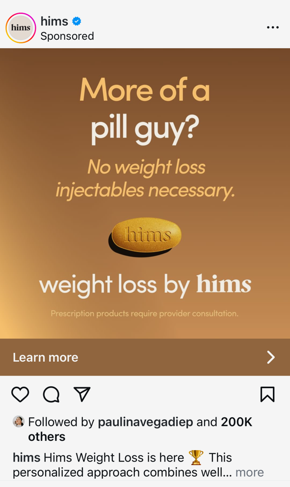
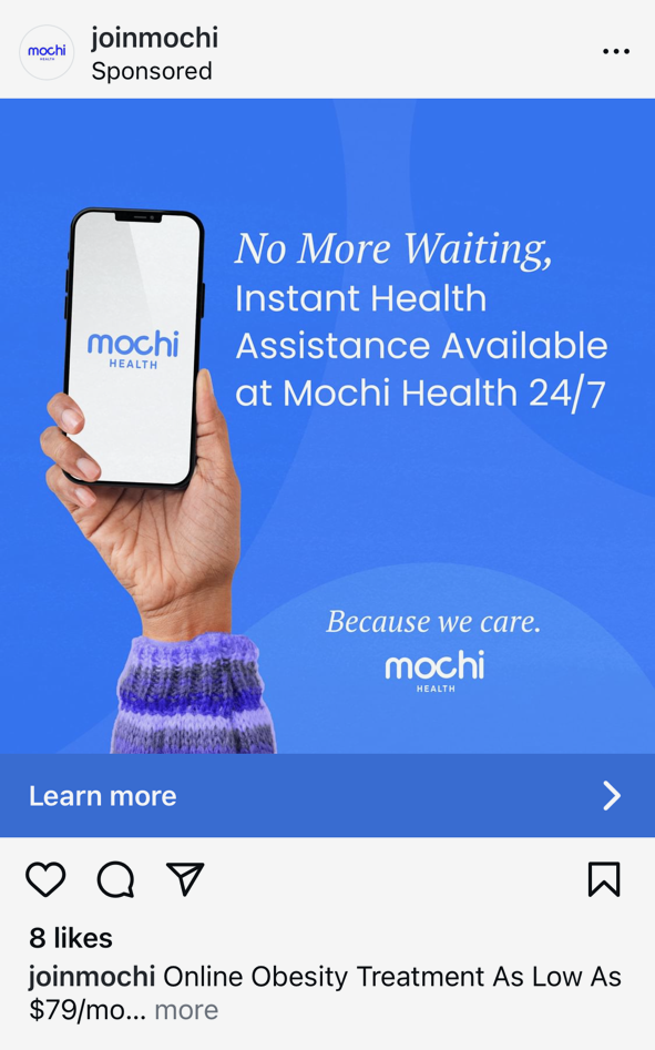
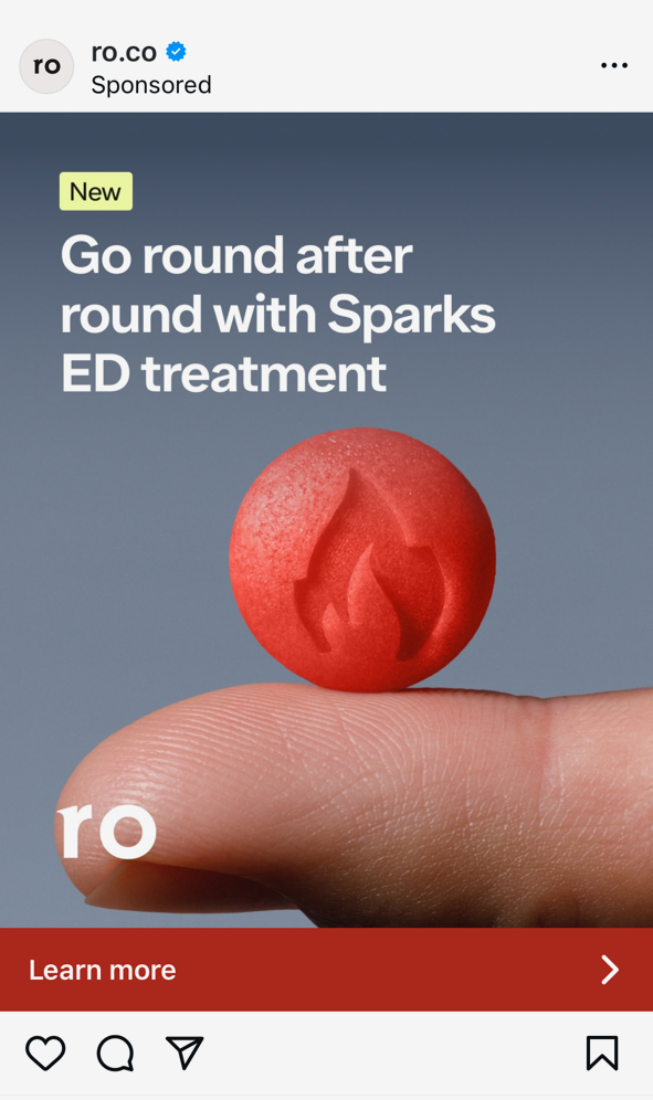
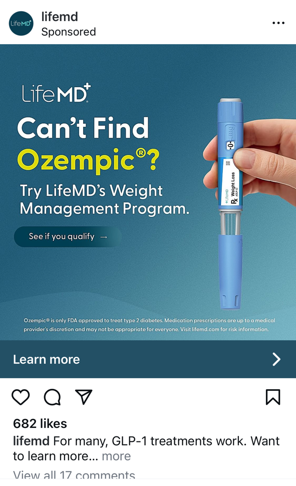
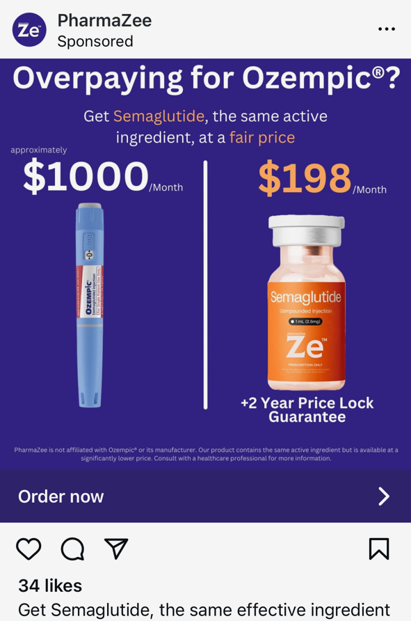
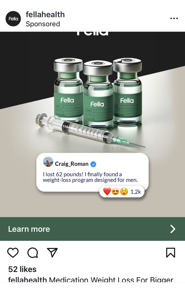
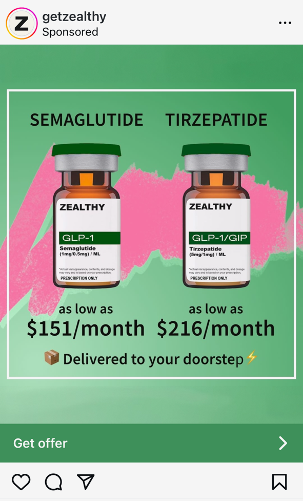
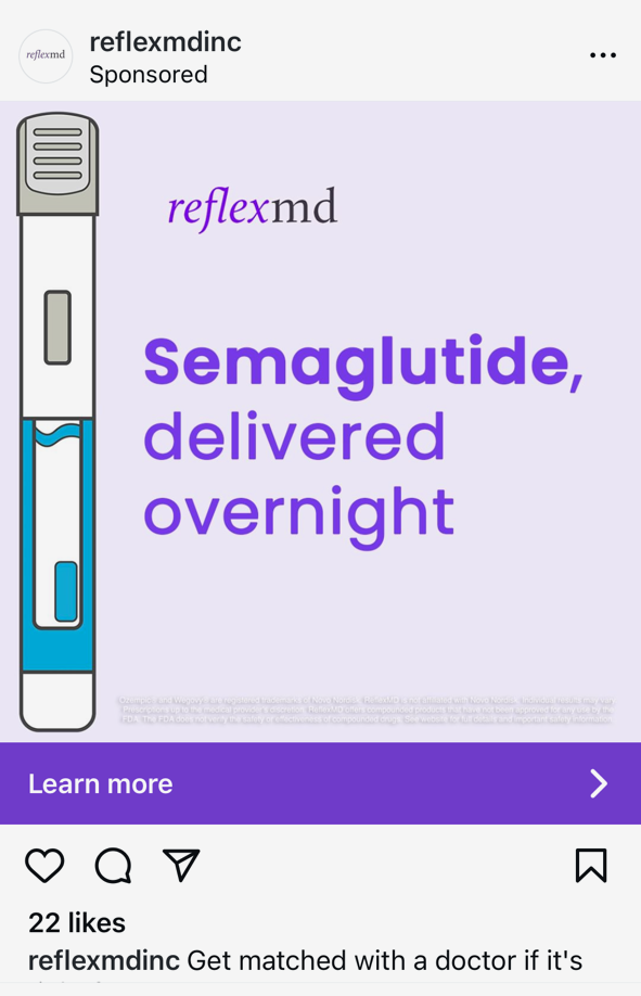
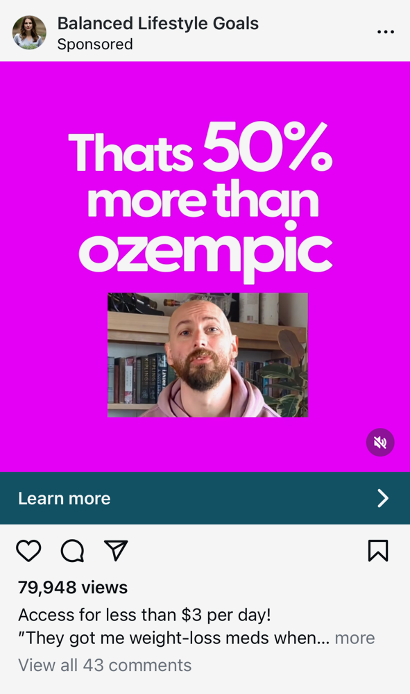
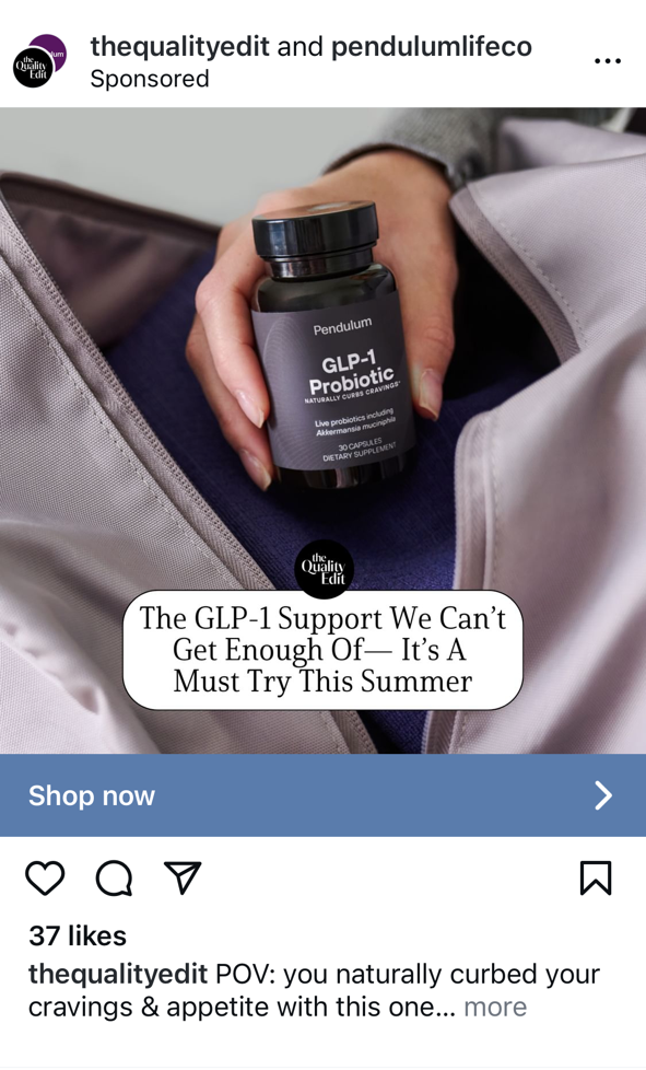
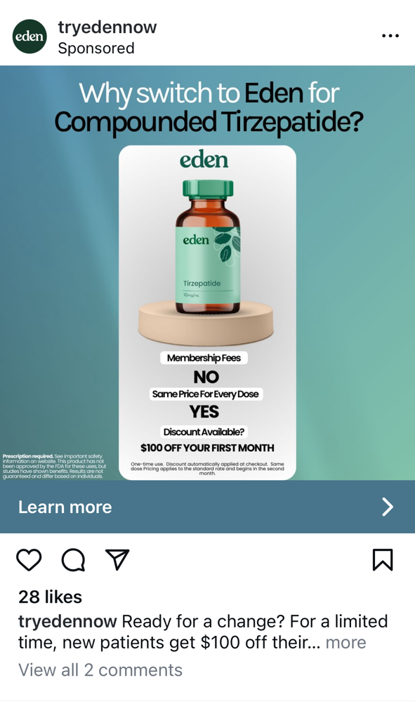
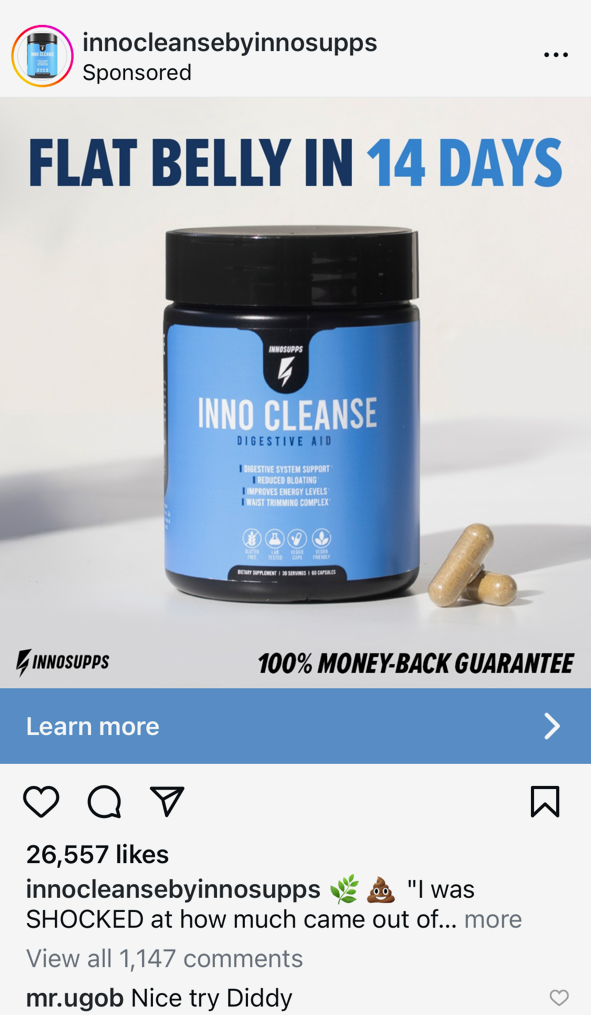
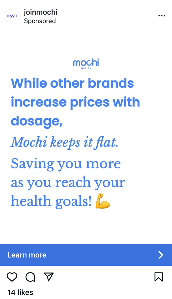
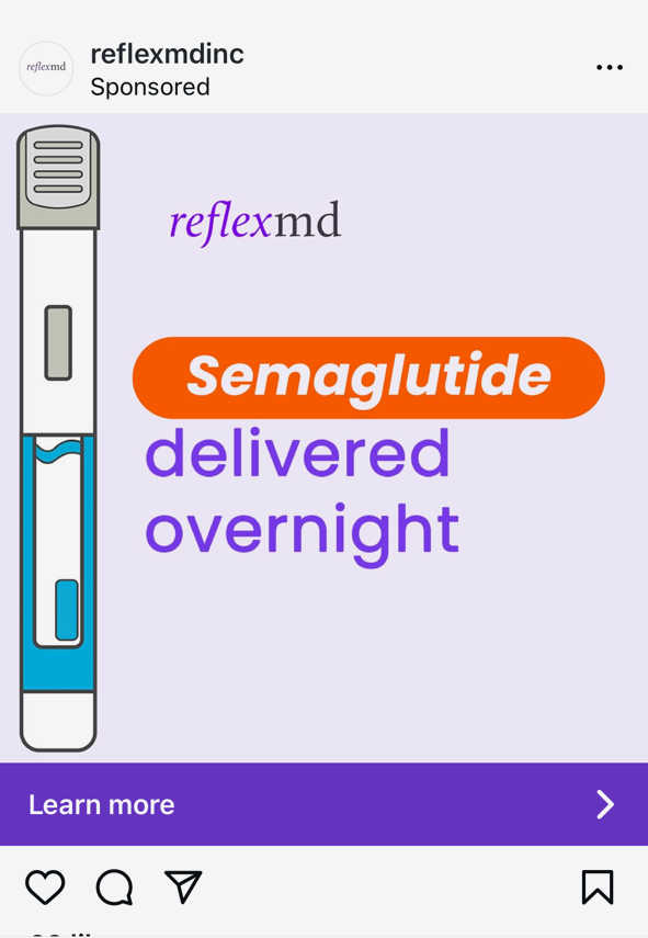
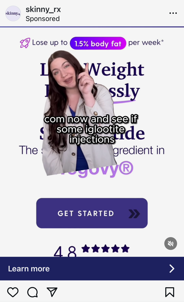
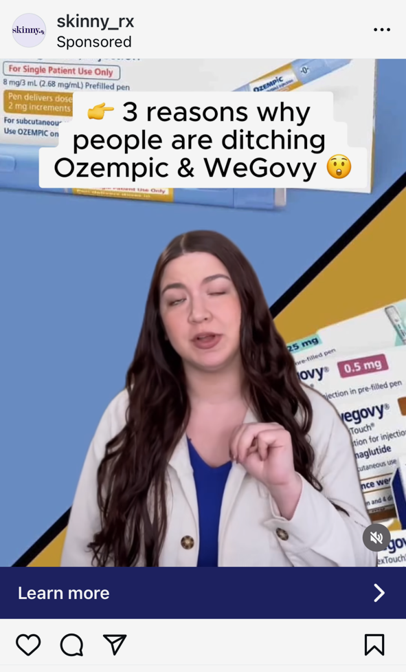
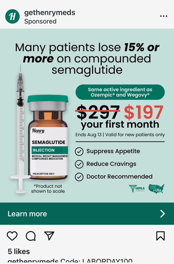
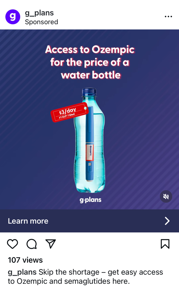
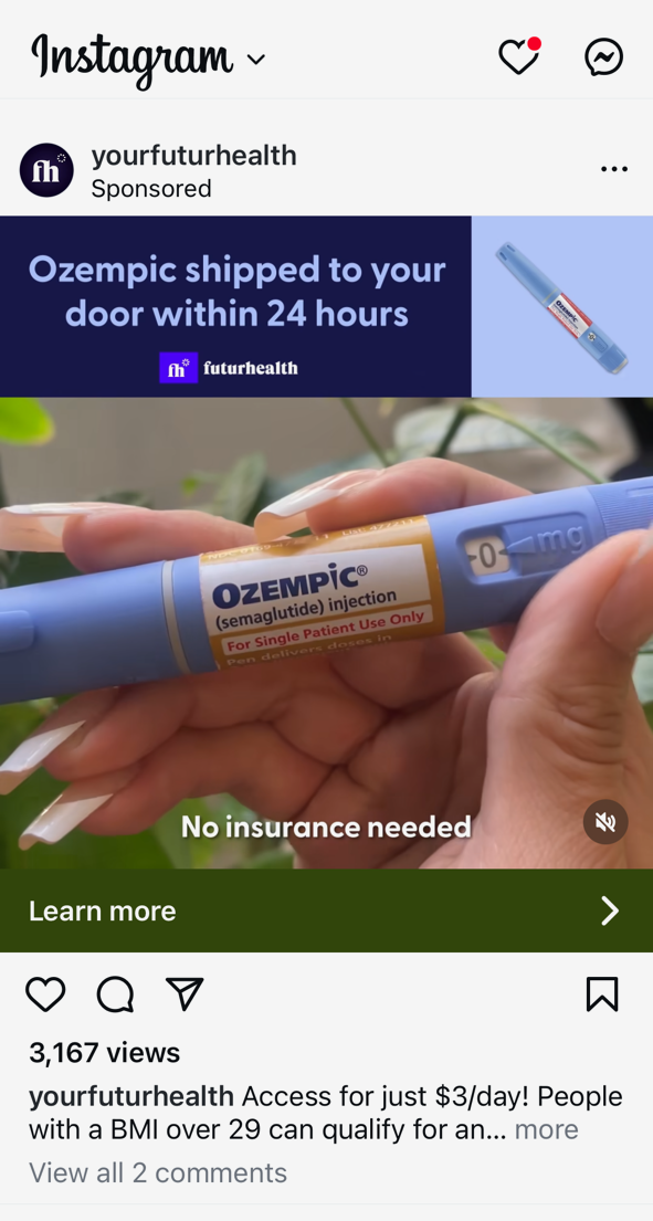
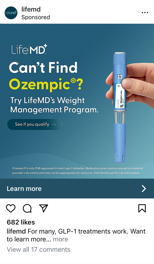
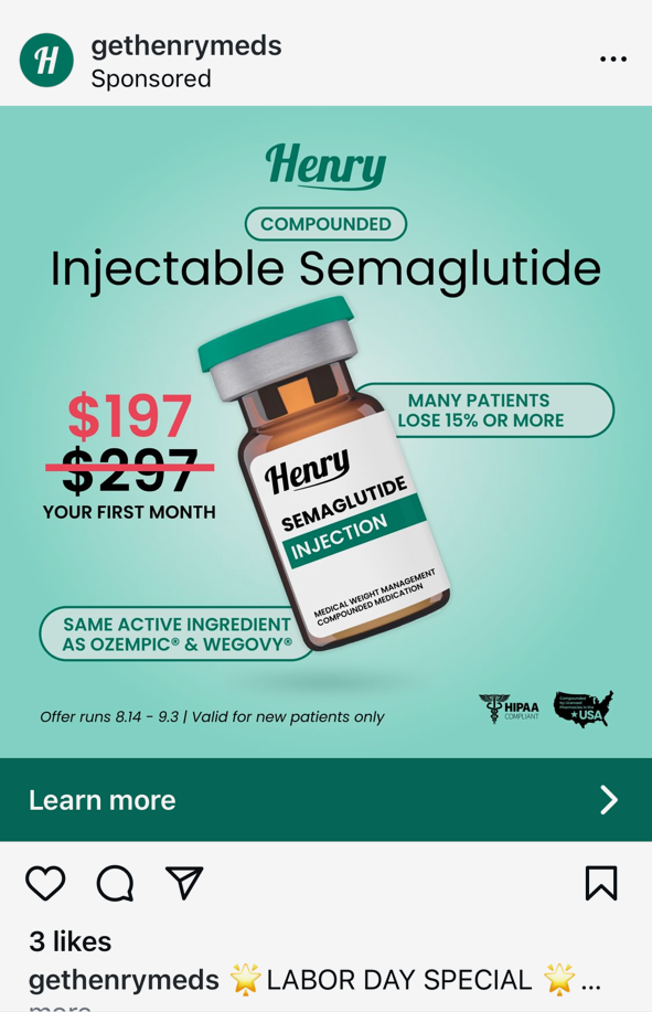
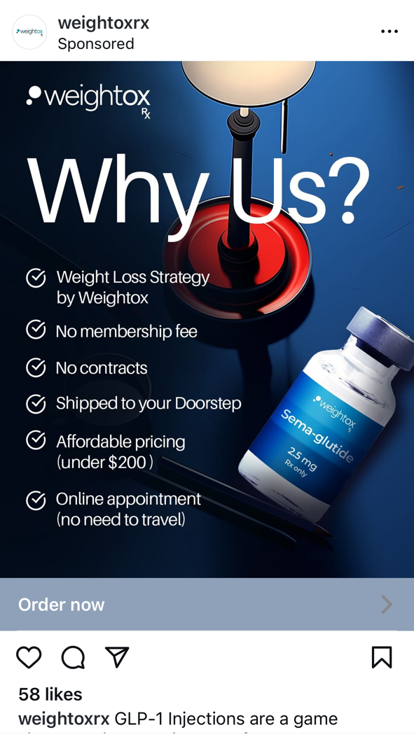
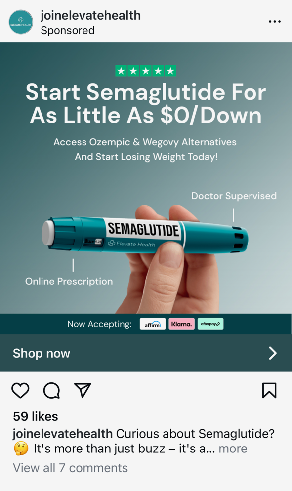
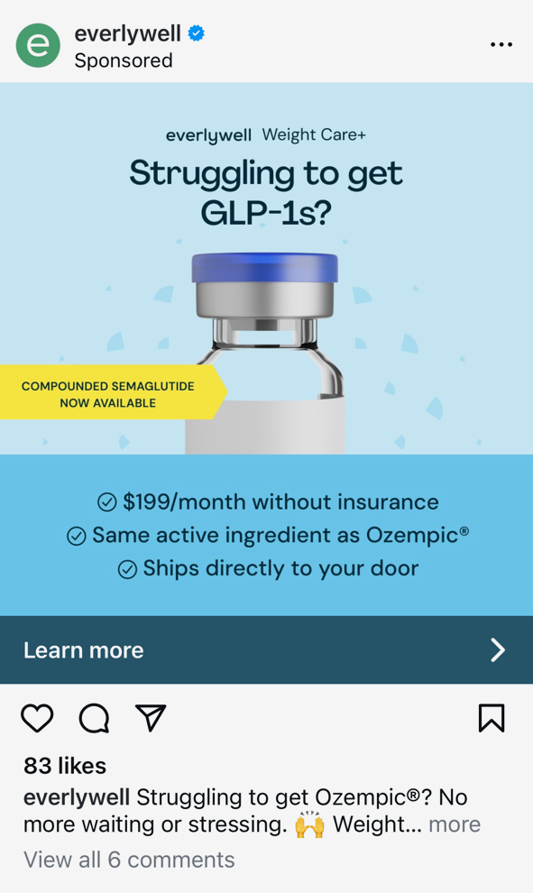
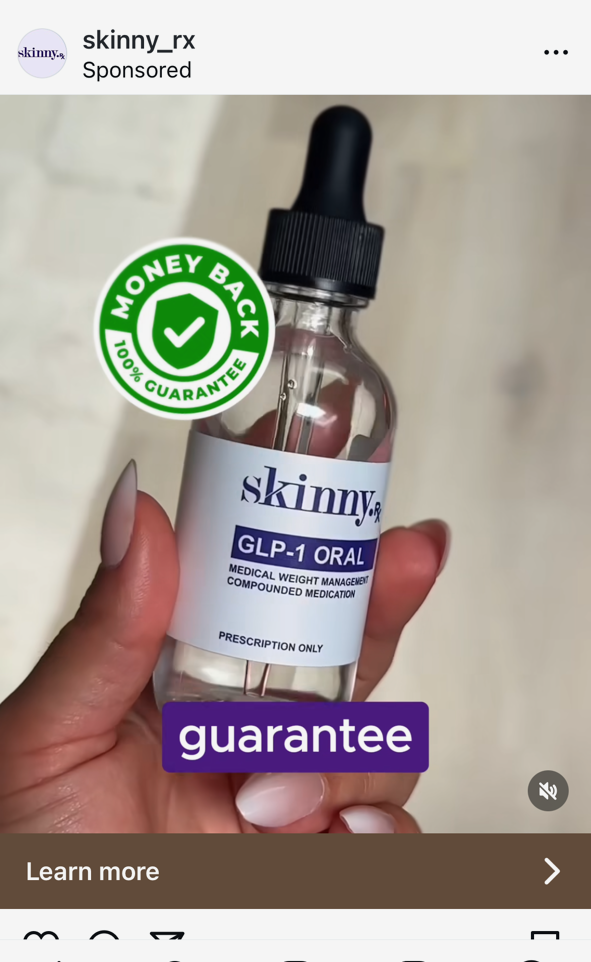
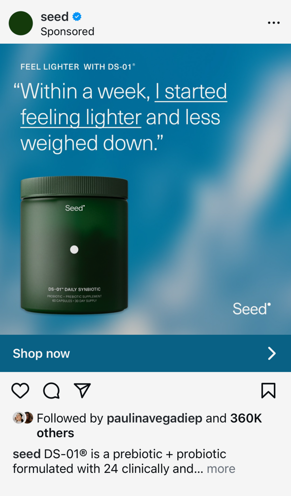
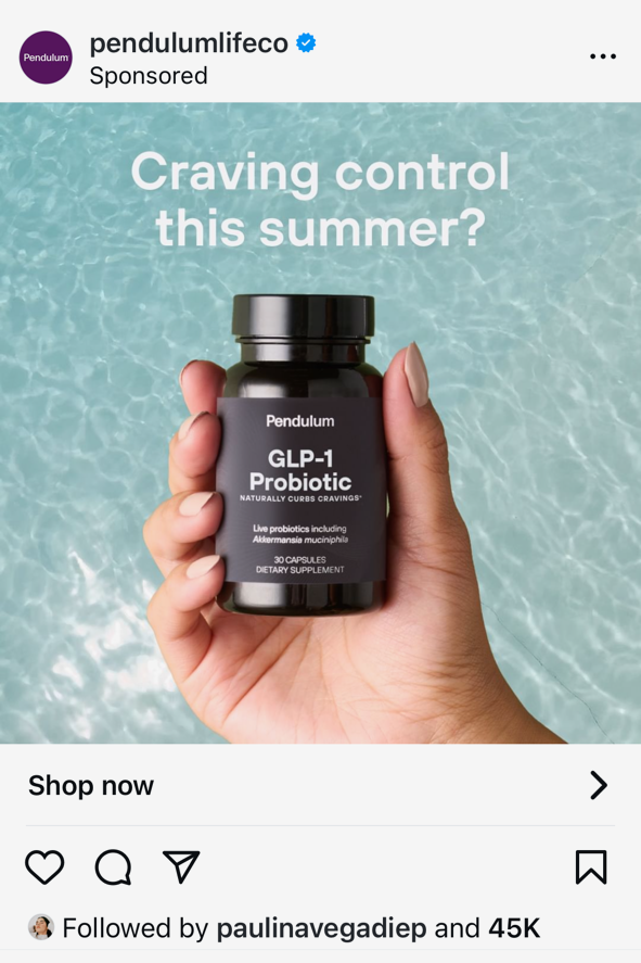
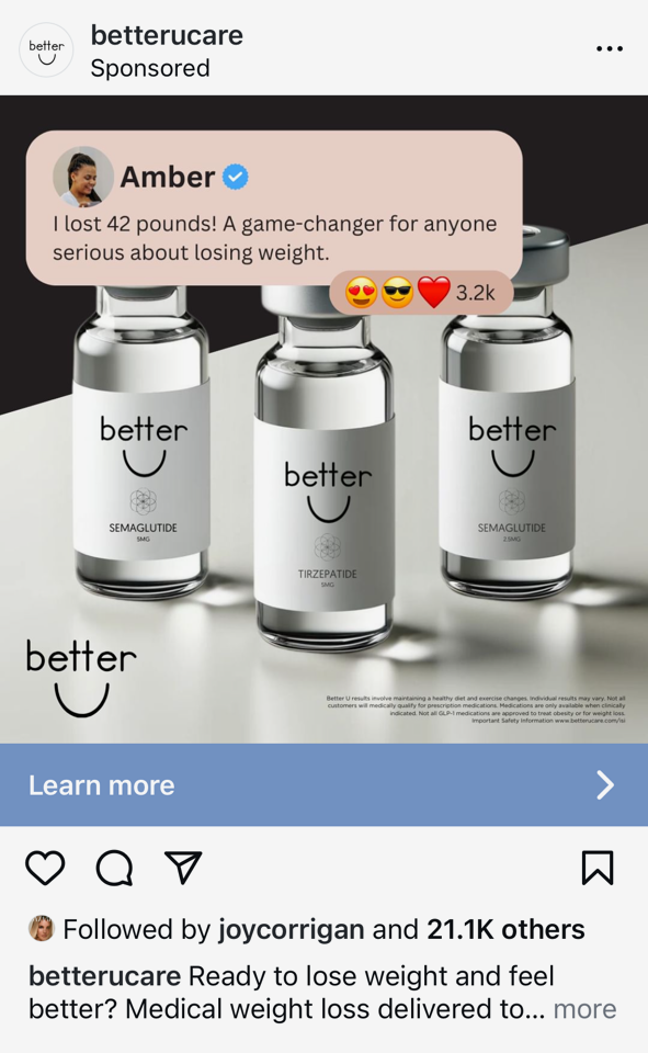
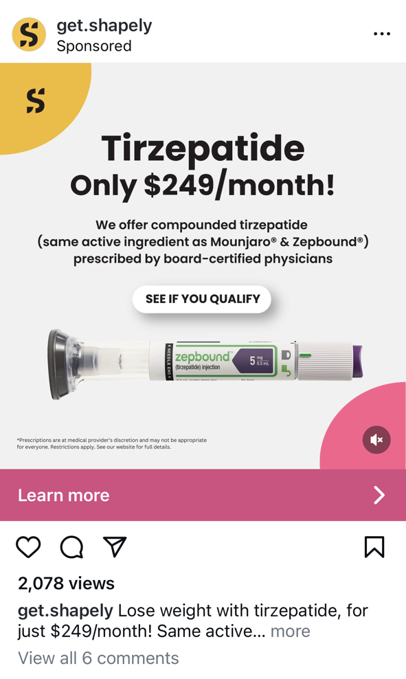
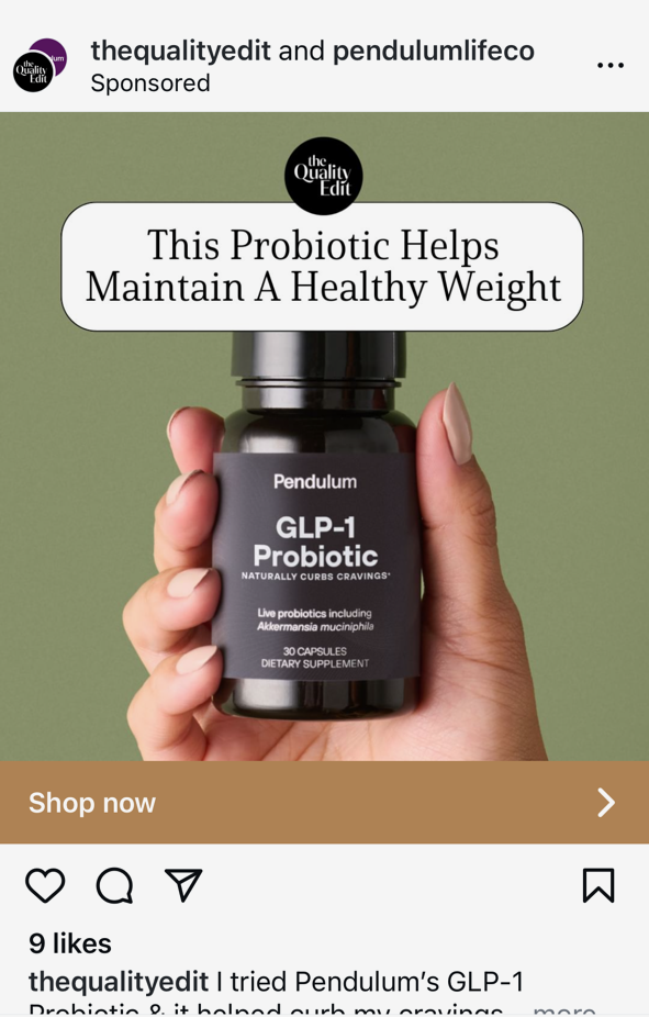
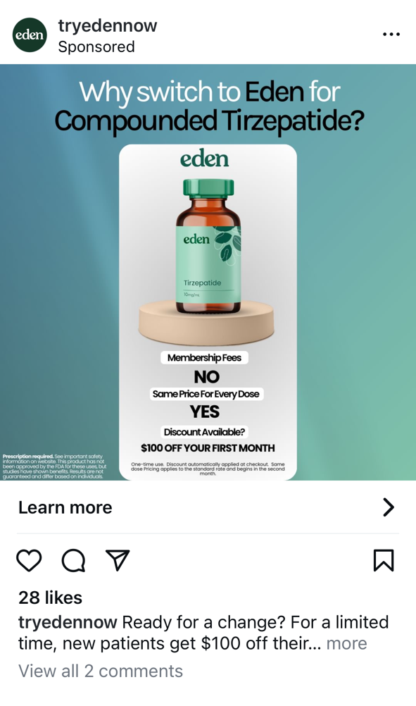
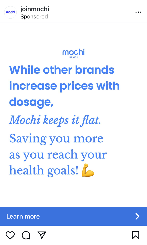
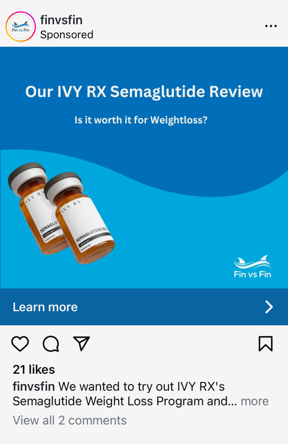
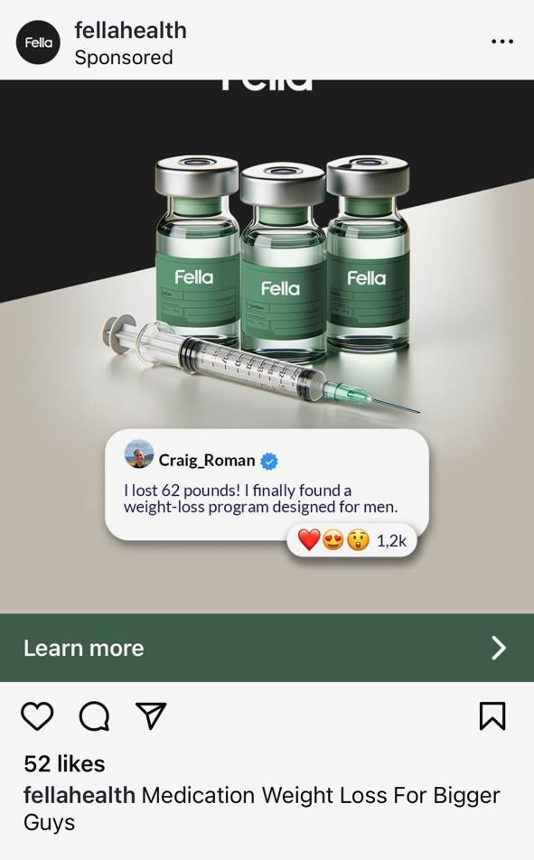
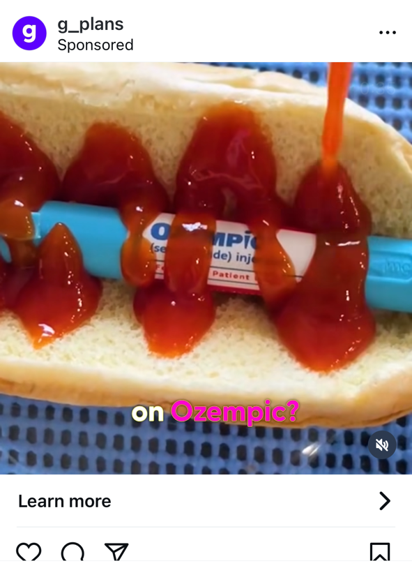
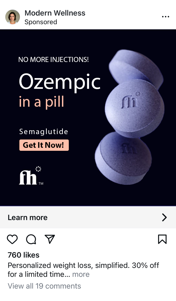
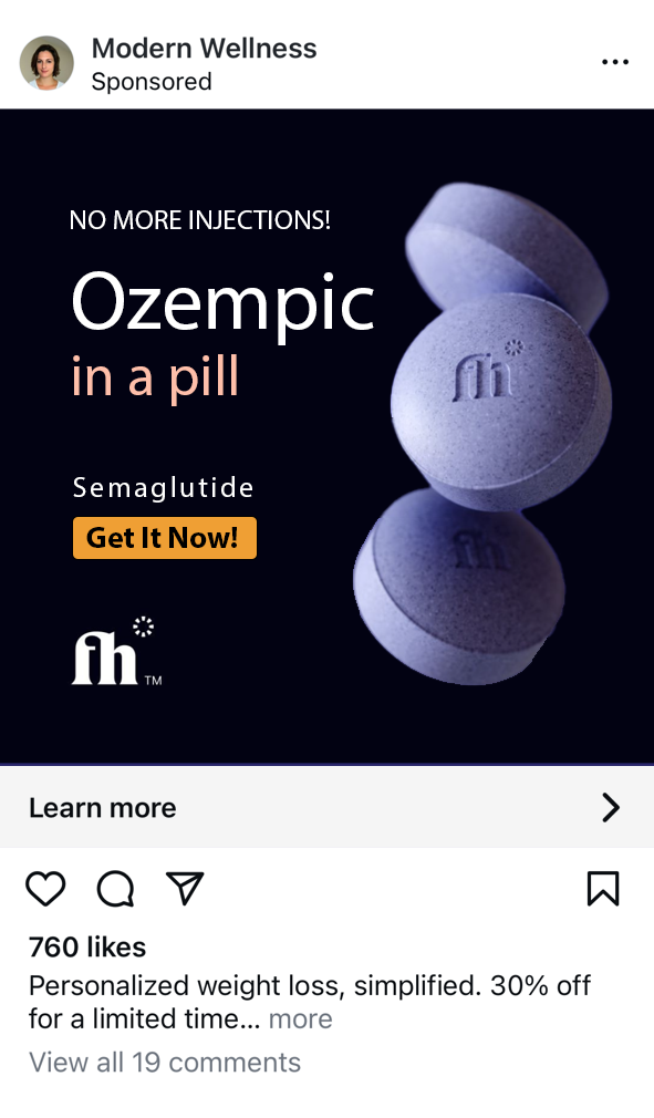
I recently explored several health websites focused on obesity and ED treatments, and now the ads from those sites are following me around the internet. Yahoo! I encountered numerous ads during just one browsing session on Instagram which are displayed below. For some of these ads, you can hover over them with your mouse to see my commentary on what I think works and what doesn’t.
If you prefer to bypass A LOT of ads, and skip directly to the analysis, click here to learn how we incorporate advertising best practices and continuously iterate on our strategies.

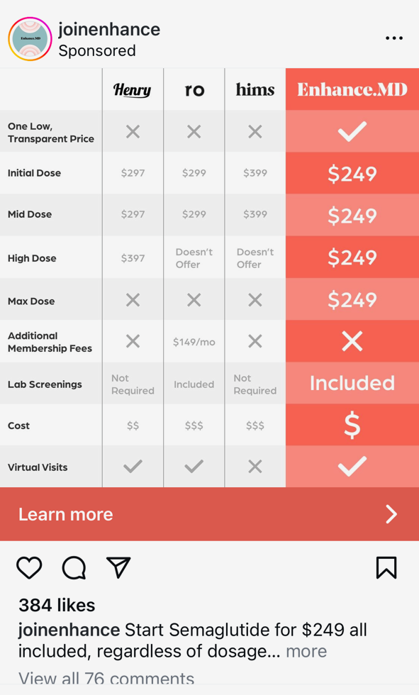


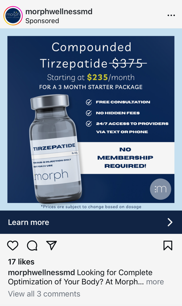
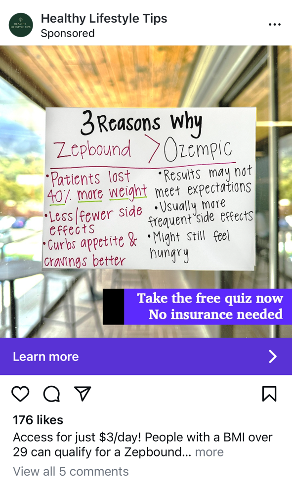
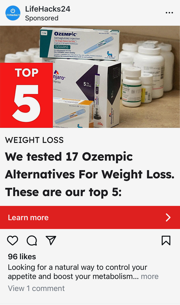













My Thoughts on The Ads Above
At this stage, I must admit that I'm not overly impressed with the ads. There's considerable room for improvement. Of all the examples, the Ro Sparks ad stands out as potentially the most effective—even though it's not an obesity-related product. Without the finger below the bright red pill, this ad would perfectly encapsulate the essential elements: headline, CTA, brand, and focal point, and nothing more. The design of the red pill named 'Sparks,' featuring an embossed flame for the ED market, is particularly ingenious. I'm curious about its market performance, although that delves into another discussion. This space is fairly new so I'm sure we'll see improvements in the ads in no time.
Focal Point Background Before & After
Ok, now let's put these principles into practice. I've selected one ad from the group that I believe has potential. For now, let's set aside the brand discussion and assume the messaging is spot on. In this exercise, I'm going to demonstrate the principle of simplicity. Take a look at the 'Before' banner's background—it uses a gradient behind the pills. If you replace the gradient with a solid background, as seen in the 'After' banner, you'll notice it really pops off the page. It might not seem like much, but after testing this on hundreds of ads, I can almost guarantee an increase in the CTR. I also opted for a more basic font—avoid fancy fonts and stick with a simple sans-serif, such as Arial, or Myriad Pro in this case. I've also incorporated a clear call-to-action, which the 'Before' ad lacked. Now, our ad contains the four basic elements—a headline, CTA, brand, and focal point—and nothing more!
Before

After
CTA Color Test
Whenever I design banners to test, I always compare the current one with others that use Amazon's buttons and colors. Why? Because Amazon's buttons are the most clicked in the world! I know for a fact that they have tested the colors of their buttons extensively and spent millions of dollars doing so. So, why not use something that works? In this experiment the control would be the pink CTA button and test ads would include those with yellow and orange buttons.


Focal Point Size Before & After
Now back to the focal point. It appears this company has invested considerable effort in designing a custom pill for the market; why not showcase it prominently? Here’s a potential test: compare the original image with an enlarged version to highlight the product more effectively. In this specific test, I chose not to alter the placement of the original text. However, for future tests, we could consider shifting the text to the left and significantly enlarging the image to make the product truly stand out.
Before

After

Of course this is just one focal point to experiment on. We might test twenty different focal points until we discover one that performs well. Once we feel comfortable with an effective focal point we might move onto testing different copy in our headline. Of course a lot of learnings can be found in our SEM campaigns when it comes to impactful headlines, but we'll cover that in another post.
Implementing the Stand-Back Test
That concludes our iterations for now—these quick adjustments should enhance the ad's click-through rate (CTR). To ensure each ad's effectiveness, I recommend the stand-back test: display the banner on your screen, step back six feet, and check if you can clearly identify the essential elements such as the headline, CTA, brand, and focal point. If these elements aren’t immediately recognizable, the ad is likely to underperform.
Conclusion
Mastering the art of display advertising is not just about crafting visually appealing banners—it’s about creating strategic, data-driven ads that perform. Throughout this post, we've explored the essential rules for designing high-performance banner ads and the crucial role of rapid testing and iteration in refining these advertisements to maximize effectiveness. By implementing the principles discussed, you can dramatically improve both the click-through and conversion rates, ultimately optimizing your cost per acquisition and scaling your marketing efforts efficiently.
In my next post, I will delve into another of my key interests: the marketing funnel. I also plan to revisit the health sector. This sector not only captivates my attention because it's relatively new but also because I believe there are significant improvements to be made. Particularly, the integration between health products' websites and the required questionnaires or 'quizzes' for obtaining physician prescriptions or lab orders is often disjointed. Users typically start on a landing page and are abruptly redirected to a separate app for questioning. The core issue here lies in the technology; the website and the quiz frequently operate on separate tech stacks, creating significant challenges in optimizing the marketing funnel - there are separate cookies, local storage, and session storage to deal with - which are technically challenging with two different tech stacks. More specifically, how do you implement robust analytics? Stay tuned.